Straight Talk
Visual Identity Refresh_ 2024-2025
In 2009, Straight Talk partnered with Walmart to disrupt the prepaid phone market by offering the same networks at half the price—with no contracts. Over time, the brand’s look became outdated and blended into a crowded market.
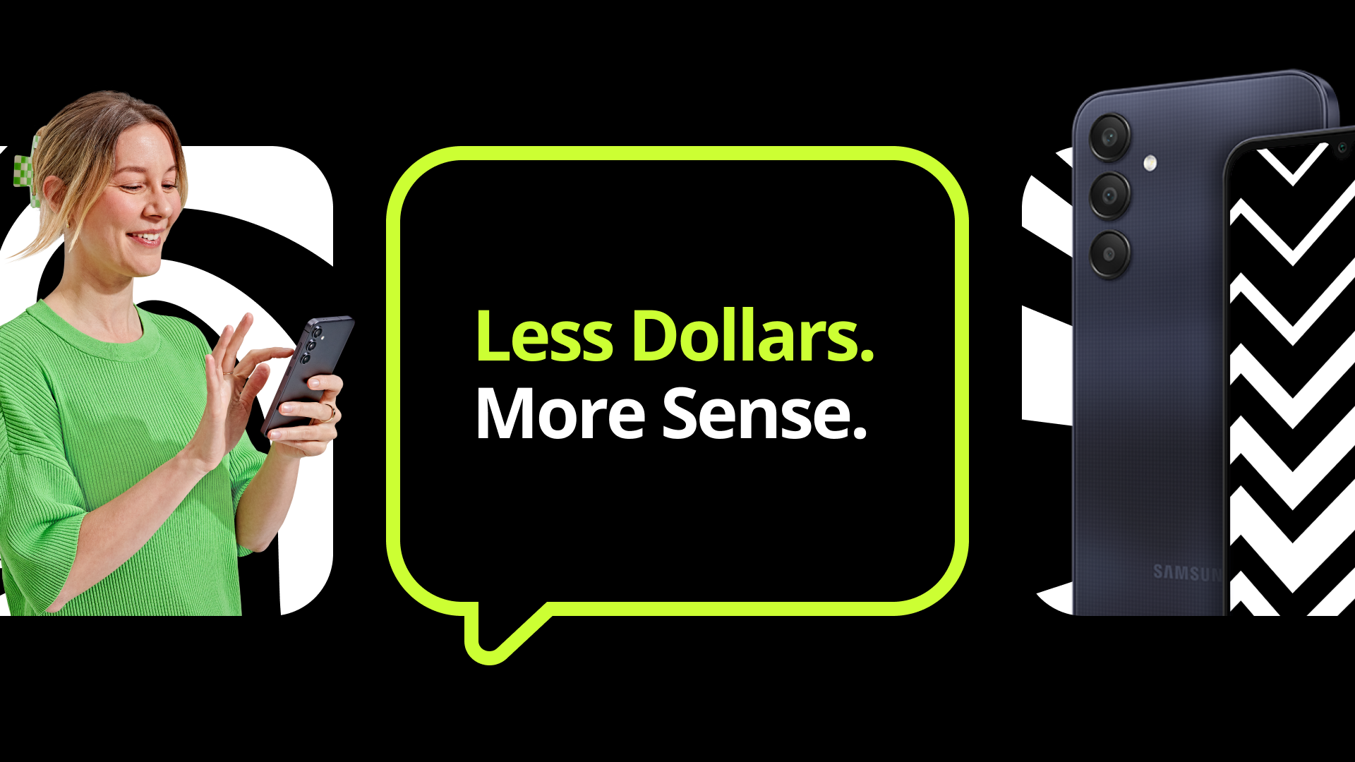
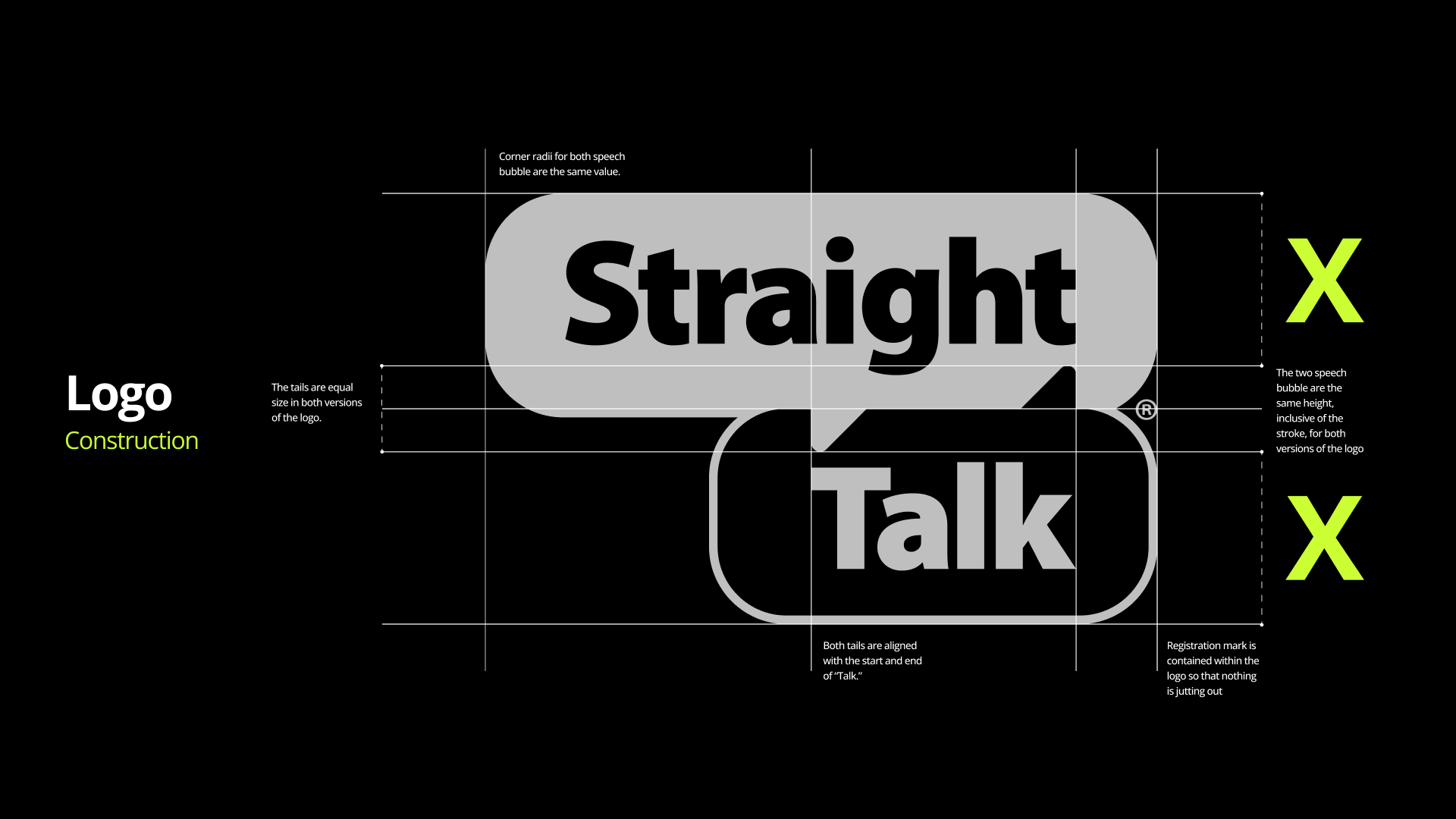
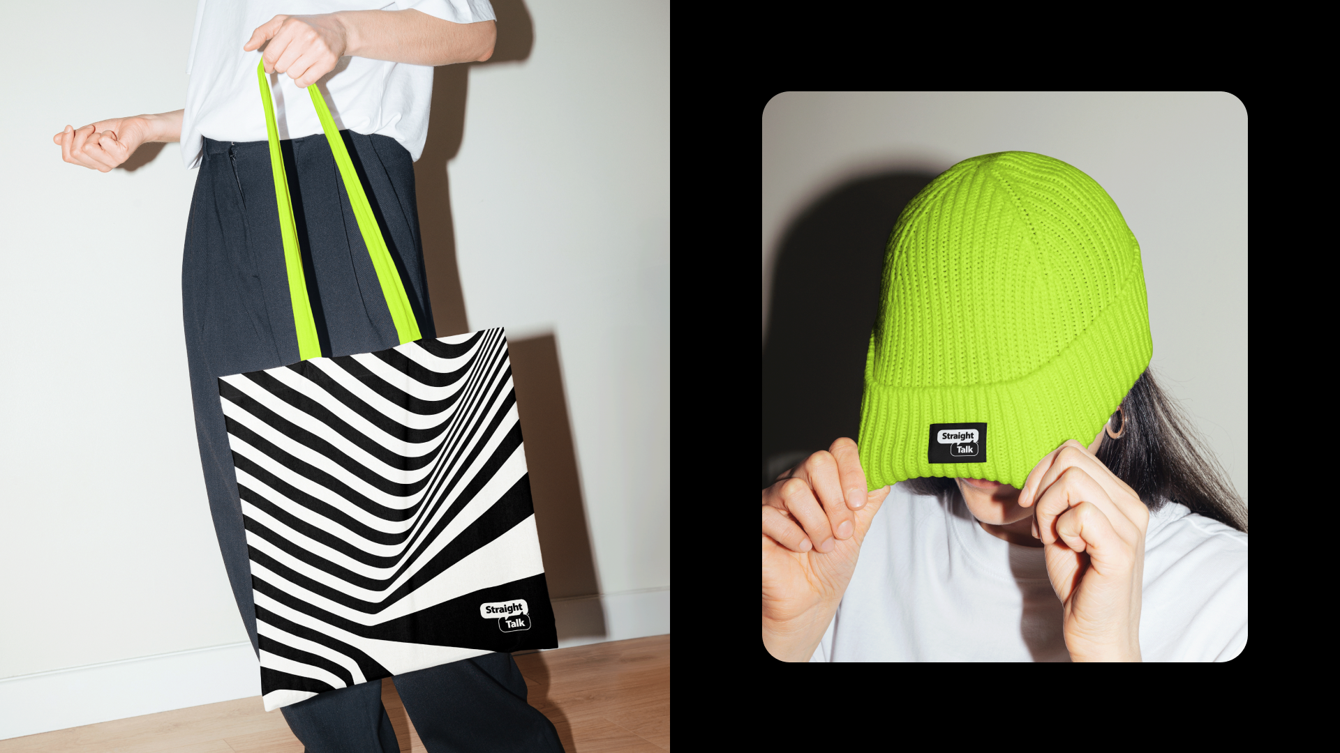
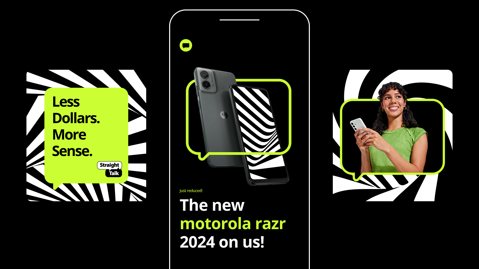
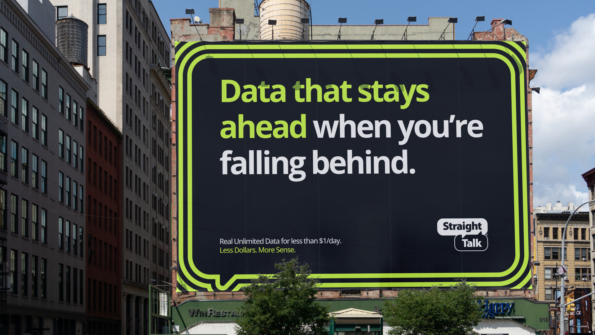
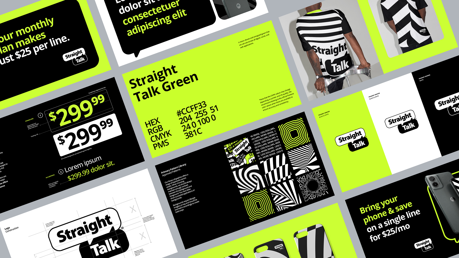
We refreshed the brand’s identity, and the challenge—use existing assets. With a bold, modern design system—newly refined logo, color palette, and the introduction of high-contrast black-and-white patterns. Green became the signature accent, making visual elements and key messages stand out clearly.
The project aimed to humanize the brand and modernize its assets to resonate better with our target audience, strengthening its market position and driving brand affinity. Studio photography captured real people in everyday moments by creating relevant scenarios for our audience. Utilizing neutral tones with pops of green and creating a cohesive humanized brand.
Unmute for sound ︎
The design refresh has created consistency across all touchpoints, from ads to in-store displays, while adaptable black-and-white patterns evolved with the seasons—featuring checkered patterns for NASCAR and ribbon designs for the holidays.
As a result, a visually striking identity drives distinction and draws consumers into Walmart’s retail aisles. In just six months and three tentpole campaigns, this refresh has reignited the brand’s momentum, delivering impactful results.


©2025 DEUTSCH DESIGN — All Rights Reserved
12901 W Jefferson Blvd — Los Angeles, CA 90066
New Business: jeff.white@deutsch.com